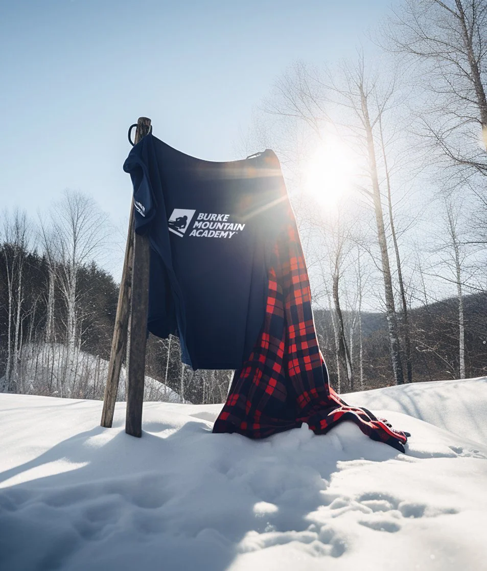

BURKE MOUNTAIN ACADEMY
Chasing greatness on and off the mountain.
You’re a gifted ski racer who eats downhills for breakfast, J-3s for lunch, and old Stenmark videos for dinner after a nice, hot Hahnenkamm-spiced-latté. But you’re also young, so you need to go to school. Ideally, in some mountainous locale where you can pursue your dreams of World Cup glory. If this sounds like you, you already know Burke Mountain Academy. And no, we can‘t help you get in.
-
BMA is the original ski racing factory. The ultimate alpine proving ground. A place that started with one coach and one student back in 1970 and has been sending shockwaves through the sport ever since. BMA regularly churns out some of America’s—no, scratch that—some of ski racing’s greatest athletes.
In the process, they’ve spawned no shortage of copycat ski academies too. But it’s not for the faint of heart. This place is about adversity—all day every day. Insane physical challenges. Inner resilience. To make it here, you’ve gotta really—and I mean, reeeeaaallly—want it. If you don’t, you’ll be back doing daffys on your home mountain in no time.
Design Challenge
Ok, so BMA is an icon. But come time for the school’s 50th anniversary, they weren’t feeling too iconic. The brand was… a conundrum, frankly. The school has long nursed its decidedly homemade aesthetic. This place has DIY in its DNA. It’s a brand that could easily be made too slick. Too pro. Too designy. Which would alienate its diehard fanbase of alums, donors, admirers and wannabes.
Head of School, Willy Booker (BMA Class of 94), knew he had to tighten up the brand—but he was laser focused on keeping it real, too. Keeping the funk. So we mapped and defined the Burke experience and made sure to never lose sight of it.
Process + Workshops
That meant keeping the Burkies, the students themselves, involved. Interviews. Workshops. Presentations. Brainstorming sessions… We did it all. Our creative team even did the dreaded Timed Hike physical test with the Burkies (which was not fun at all, not even in retrospect). We sort of did, anyway.
Conclusion
In the end, like all things Burke, the experience was deeply gratifying. It’s not every day that you get to work with a brand that’s made the Hero’s Journey: from outsider threat to challenger to champion to hero to icon. So few have. (The Grateful Dead comes to mind, but we missed them.) But Burke Mountain Academy has made that journey. Full-on Joseph Campbell style. They did it their way, every step of the way, and they made it to the top.
When you put your hands on a brand like that, you do so carefully. You measure twice and cut once. You include people. You check again. You lose sleep. You throw it away and start again. You worry. It’s just the nature of it.
But amidst all that, somehow you also have to be fearless. If you’re not fearless, all is lost anyway. And somehow, thanks to Willy’s leadership, early indications are that we found that balance between respectful and fearless. Which is a giant relief, because our Executive Creative Director is also a BMA alumni and he would’ve never heard the end of it had we not.
WHAT WE DID:
Research
Strategy
Brand Purpose
Brand Identity
Brand Guidelines
Messaging
Website
Apparel
Collateral
Digital
Social


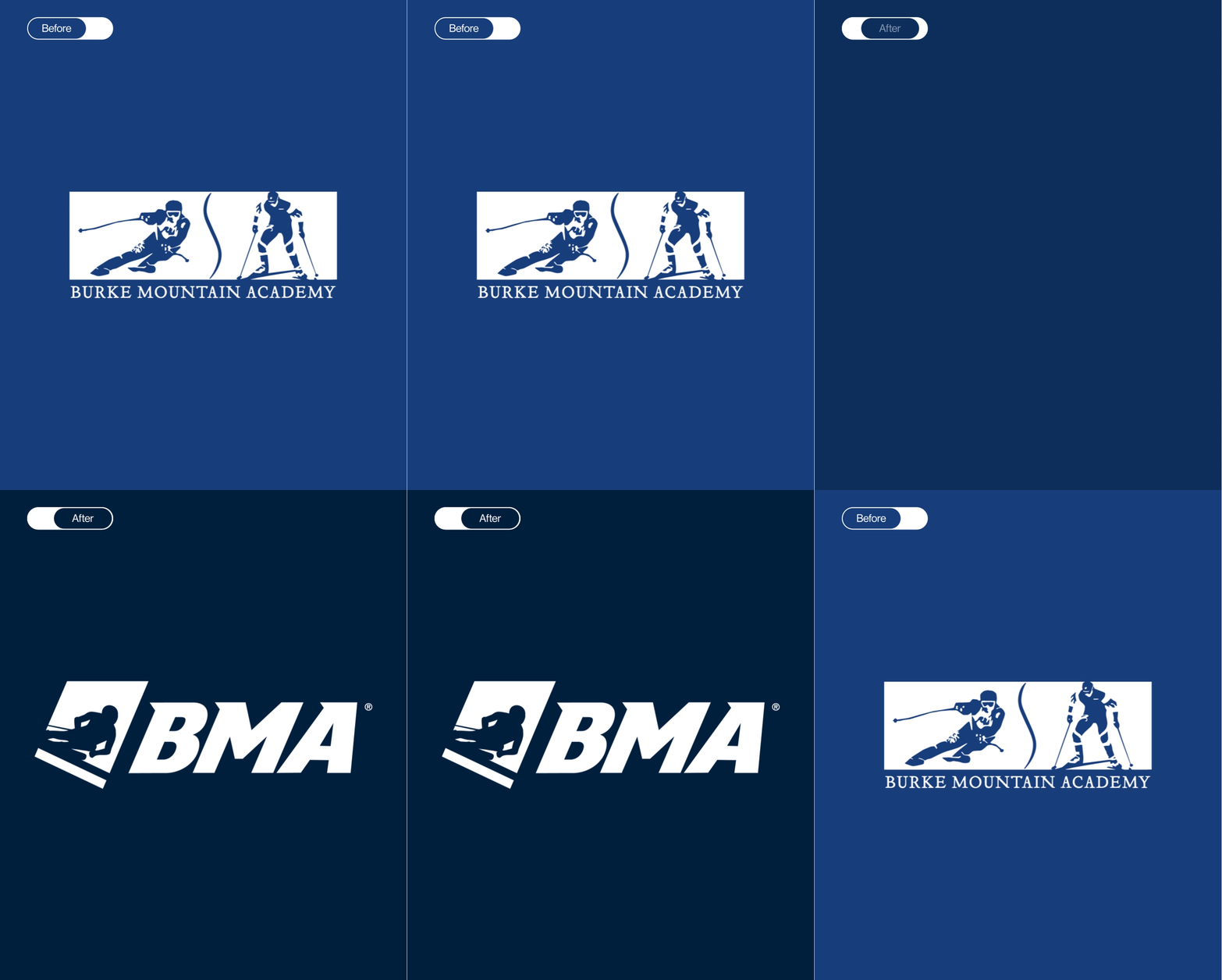
The school's logo was ready for an overhaul but it carried a lot of recognition in the ski racing world. The school ditched cross-country skiing years ago, and committed to alpine, so the symbol was streamlined and redrawn with a new singular skier—embodying speed, precision and our new hero brand archetype.
The geometry of the holding shape was imbued with the same precision, accentuating angles associated with speed. For the evolution of the wordmark we turned to Astoria, a typeface with a subtle top left serif that has been modified on each letter to match the angle and precision of the new logo. The result is a mark ready for the next 50 years while remaining recognizable to Burkies and fans from the last 50.
Evolving an icon.


From an outsider to an idol.
BMA began as a wild experiment in 1970 in Nowheresville, VT—an outsider, to say the least. It’s evolution to the top of the podium in the ski racing world has been a true hero’s journey. Our brand workshop uncovered a clear hero archetype underneath everything this school does. That brand personality made its way into every execution, positioning BMA as a hero brand in the category.